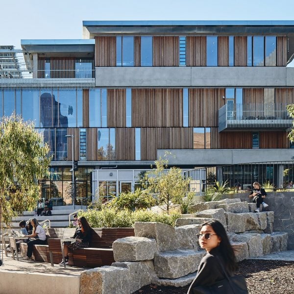
An external concrete stair with terraces connects the floors of the Student Pavilion at the University of Melbourne, designed by US studio KoningEizenberg.
The 2,508-square-metre centre has a variety of dining, work, events and meeting spaces where students can “study and linger” throughout the day to help combat social isolation.
It forms part of a wider student precinct for the university developed by a consortium of architects, including Los Angeles-based KoningEizenberg.
“At a time when the world is increasingly connected through technology, universities globally are actively addressing students’ increasing sense of social isolation,” explained KoningEizenberg.
“The University of Melbourne, a predominantly commuter campus, provides a case study for how to build community and a sense of belonging with the new widely popular student precinct,” it added.
The Student Pavilion is designed around what KoningEizenberg described as an “exposed concrete skeleton” – a grid frame with large angular columns.

Inside there are four levels. On the ground floor, a dining area is surrounded on all sides by outdoor seating while, above, both the first and second floors provide informal study spaces, with a self-contained recreational library to the east.
The third floor is designed with a more “domestic” feel. It contains rooms for events and recreation that open out onto a roof terrace sheltered by a steel canopy
These levels are all connected both by an internal staircase and by the large external stair at the building’s western end, which is wrapped by an oversized steel balustrade.

As the upper balconies would have required 1.8-metre-high railings, they have instead been covered with a layer of tensile steel mesh.
“It’s like a big treehouse with a range of varied informal spaces distributed inside and out: big, small, dark, bright, cosy and expansive,” said KoningEizenberg principal Nathan Bishop. “Whatever your preference, you can find a spot to camp out for the day.”
The interiors of the Student Pavilion are defined by the large concrete columns and floors, with wood and glass partitions and larger slatted wooden screens used to divide spaces.
“We riffed off the surrounding brutalist buildings, turning them inside out and warming them up,” said Bishop. “The textural wood battens and screens soften the strong sculptural concrete frame and make the pavilion feel like a space for play.”

Other recent university buildings featured on Dezeen include the steel-framed Study Pavilion by architects Gustav Düsing and Max Hacke in Germany and a “democratic and non-hierarchical” building for a Sydney law school.
Previous projects by KoningEizenberg include a beach house on Shelter Island with wood-lined interiors and a museum in a historic library that was struck by lightning.
The photography is courtesy of KoningEizenberg.
