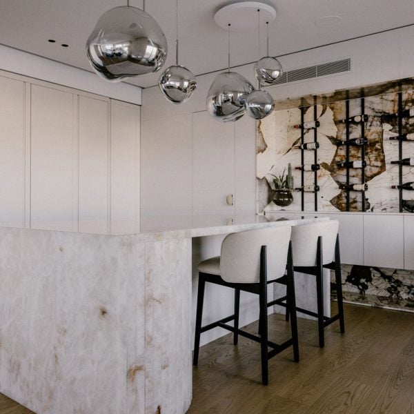
Promotion: natural stone by Italian company Antolini has been used throughout the interior of this apartment in Malta designed by architects Sabrina Soldà and Keith Pillow.
Set overlooking a bay on the Maltese coast, the interior scheme of the 400-square-metre space was informed by the colours of the surrounding natural environment, with blues, whites and yellows making up the core palette.
Part of Antolini’s Exclusive Collection, a range of stone products were integrated throughout the space, including Patagonia Original ‘Extra’, Dover White, Cristallo Lumix and Cristallo Traslux.
“In this project, we were inspired by the colours of Malta, which is why the property is mainly clad in two materials – wood and stone,” said Sabrina Soldà.
“The main stone we chose with Antolini is a very light white crystal that echoes the colours of the waves, with some brownish veining that resembles the colour of the limestone,” she described.
“We matched the colours of the landscape with the nuances of the interior design, creating an optical consistency between the interior and the exterior,” Soldà continued.
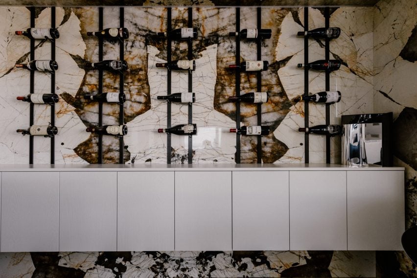
In the kitchen, one key piece made using Antolini’s materials was a wine storage space to display part of the client’s wine collection.
The “wine library” was made using slabs carved from a single block of stone – Antolini’s Patagonia Original ‘Extra’ natural quartz.
“The Patagonia Original ‘Extra’ really gives the idea of nature’s creation,” said Soldà. “It’s as if the natural stone hosts random brushstrokes of colour created by nature depending on the sediment,” she described.
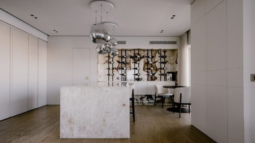
Another prominent stone element added to the space was a kitchen island, which was created using Cristallo Lumix slabs for the worktop and backsplash areas.
The pale, pearly white island was intended to look more like a bar than a working kitchen service area.
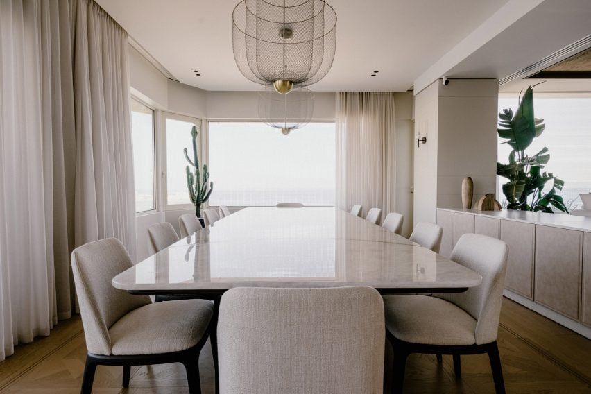
In the living space, a dining table with a 3.6-metre-long surface was created by placing two slabs of Antolini’s Cristallo Traslux stone in Lux finish beside one another.
One stone slab was used to form the central section of the table, while the second was divided into two parts, connected to the central core through a brass system.
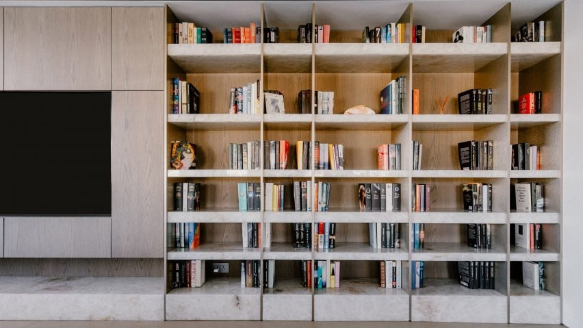
Opposite the table, a large in-built bookcase was added to the living space, comprised of stone bases and shelves using Cristallo Lumix, with oak and metal sides.
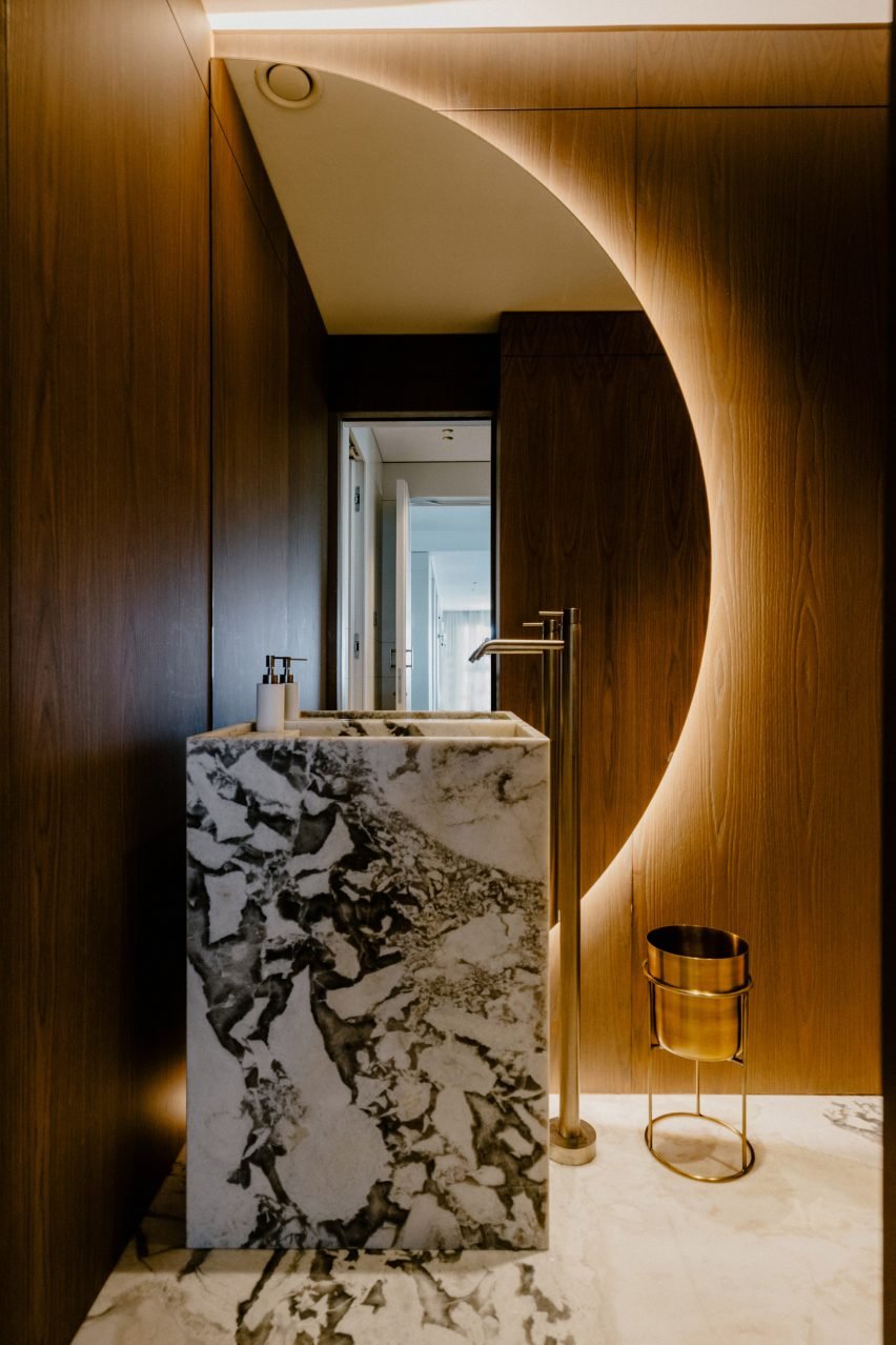
Marble was also used in the apartment’s bathrooms, with a statement basin in Dover White marble processed in an open-spot pattern in one bathroom combined with brass and wood details.
Meanwhile, in the second bathroom, a walnut-coloured oak [vanity unit//cabinet] with cannulated wooden doors is topped with a marble surface in Antolini’s Invisible Light, matching the art deco style of the space.
To learn more about Antolini and browse all available materials, visit the brand’s website.
The photography is by Diana Iskander.
Partnership content
This article was written by Dezeen for Antolini as part of a partnership. Find out more about Dezeen partnership content here.
