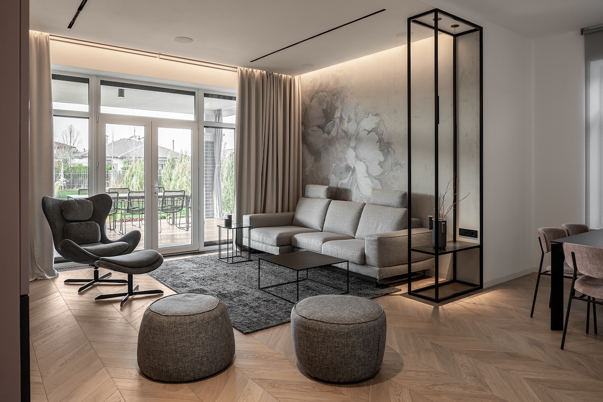
Designed by Natalia Chernyatevich and Anastasiia Kyrpeta, House Violet is a modern Scandinavian home—one that brings together minimalist elegance and playful colors. We see the clean lines and neutral colors of the Scandi style dominating the living space. Simultaneously, splashes of subtle color bring the bedrooms to life. Throughout the home, thoughtful decor and smart lighting solutions make sure the space is visually aesthetic.
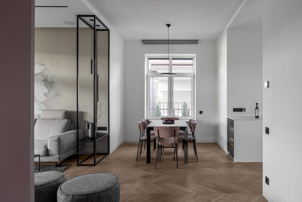


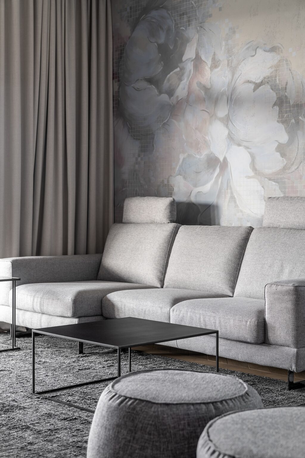

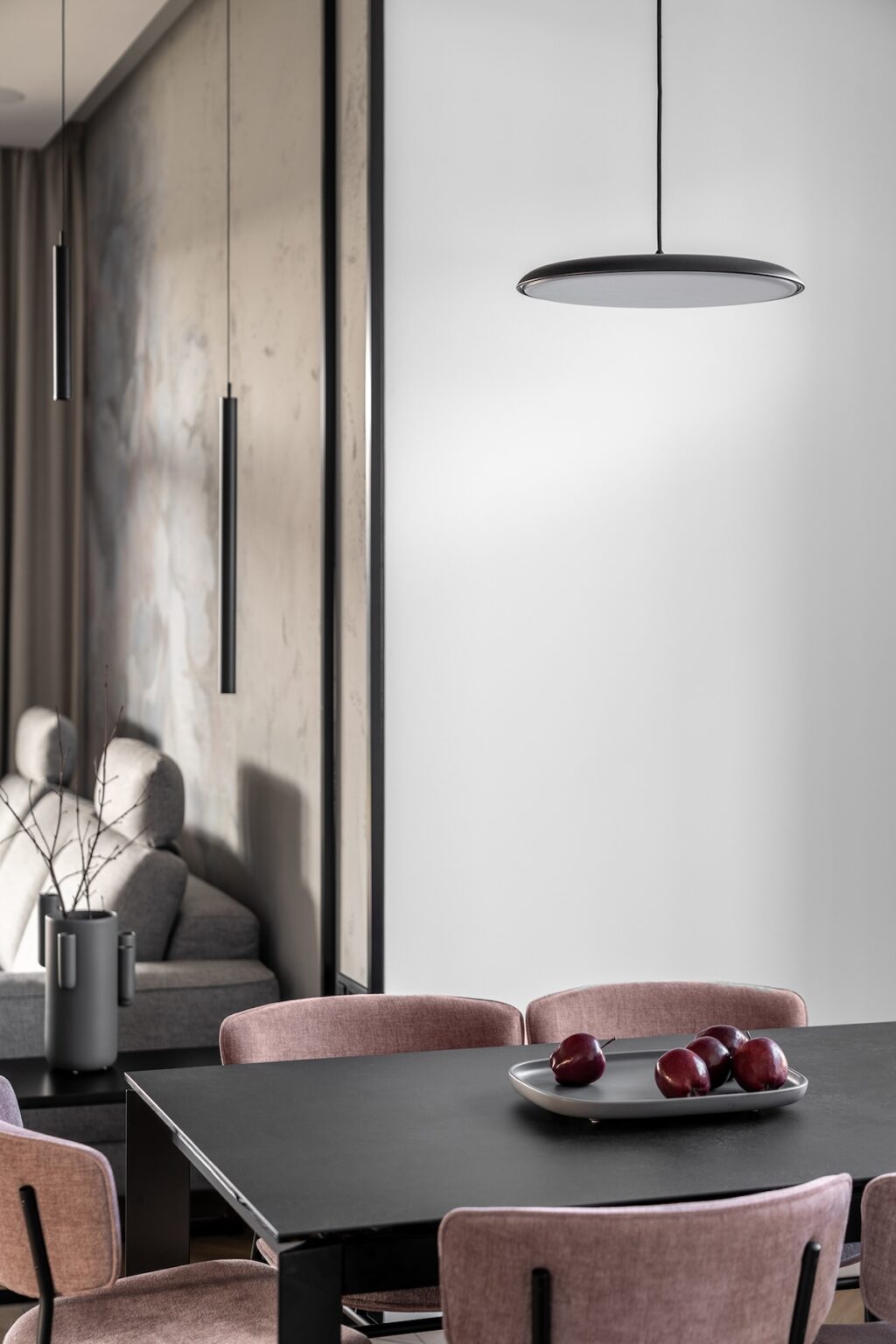

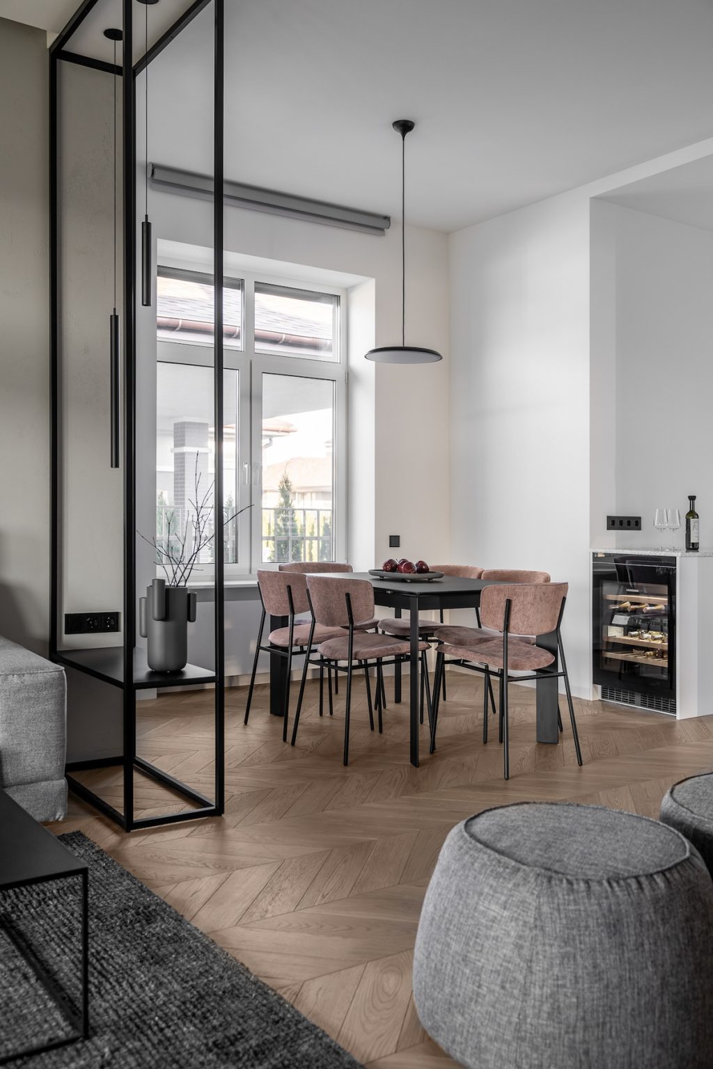

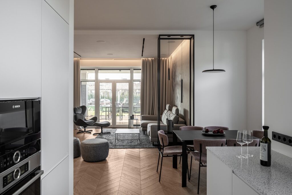

The living and dining area in this house follows a largely open floor plan. The only partitions are large matte black frames, also serving decorative purposes. The paint is what delineates both regions: the dining area has stark white walls, while the living room uses subtle beige floral prints for the wallpaper. Smart and comfortable seating spaces can be seen in the living room, paired with a matte black coffee table. The dining space uses a similar matte black table, paired with dusty pink chairs. A special mention for the outdoor views in the dining area! Throughout, the wooden flooring unifies the space.
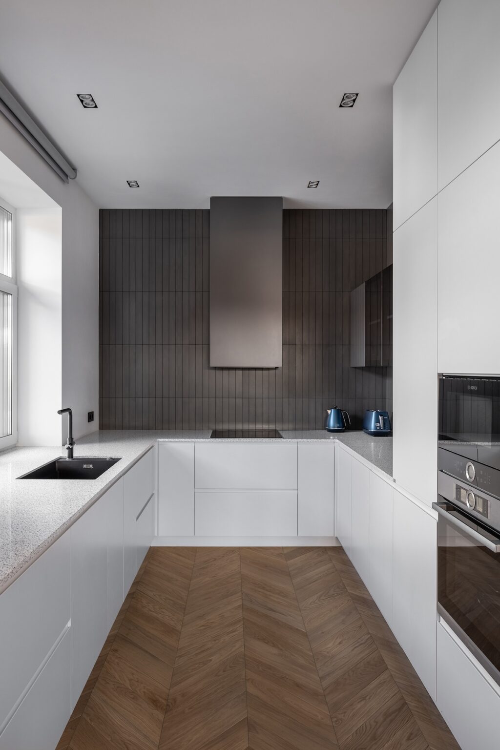

The strategic use of white cabinetry visually opens up the kitchen. Even then, the dark brown backsplash on one of the walls forms the focal point of the space and adds warmth. Not to forget the dramatic presence of the matte black sink!
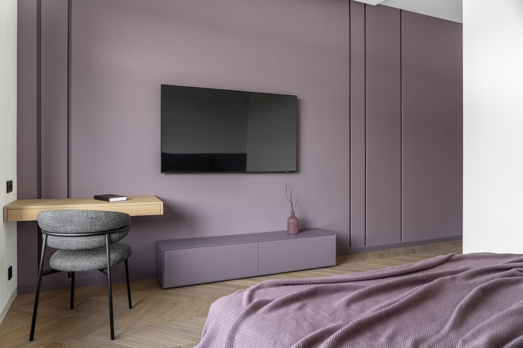

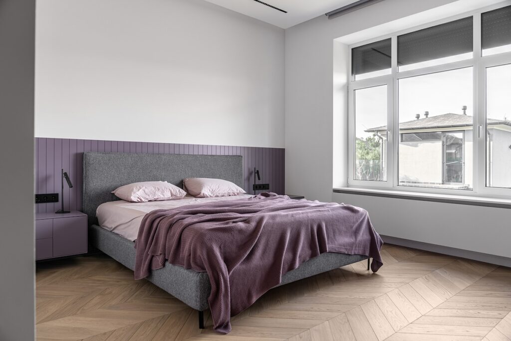

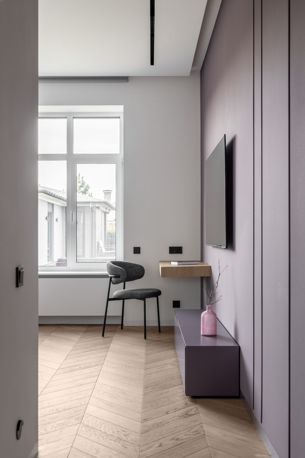

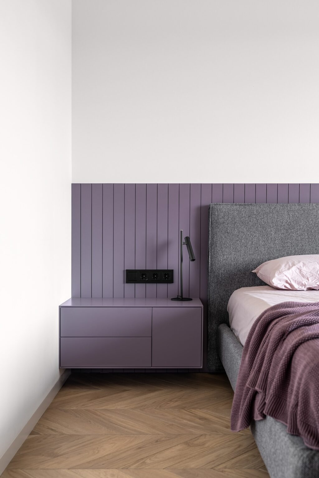


Now comes our favorite part of the design project: the lilac bedroom. The base of the color palette is white—and is complemented by a beautiful lilac color. We see a statement lilac wall, as well as a partially painted one behind the bed, accentuating the headboard. This color is also used for the entertainment complex and wall-mounted side table. Simultaneously, a light oakwood desk offers ample work space while balancing out the color scheme.
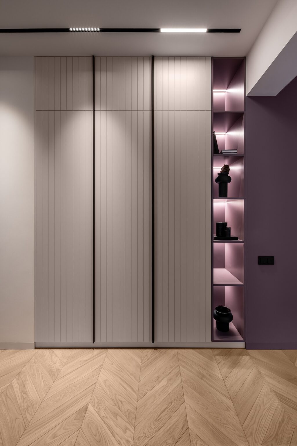
Finally, the sleek cabinetry provides ample storage space. It also makes room for decor pieces in the strategically lit compartments.
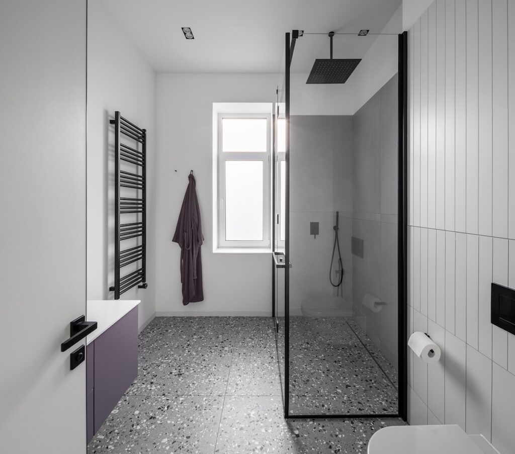

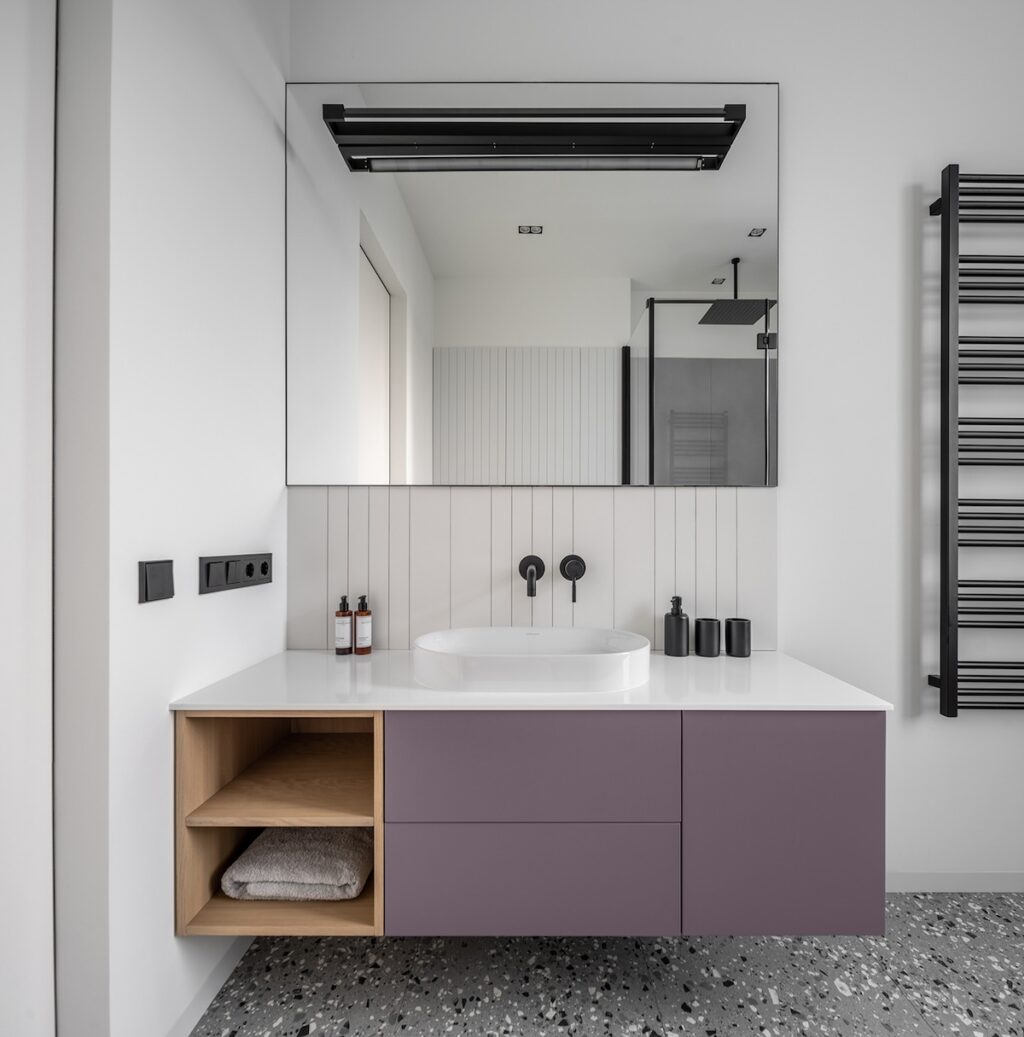

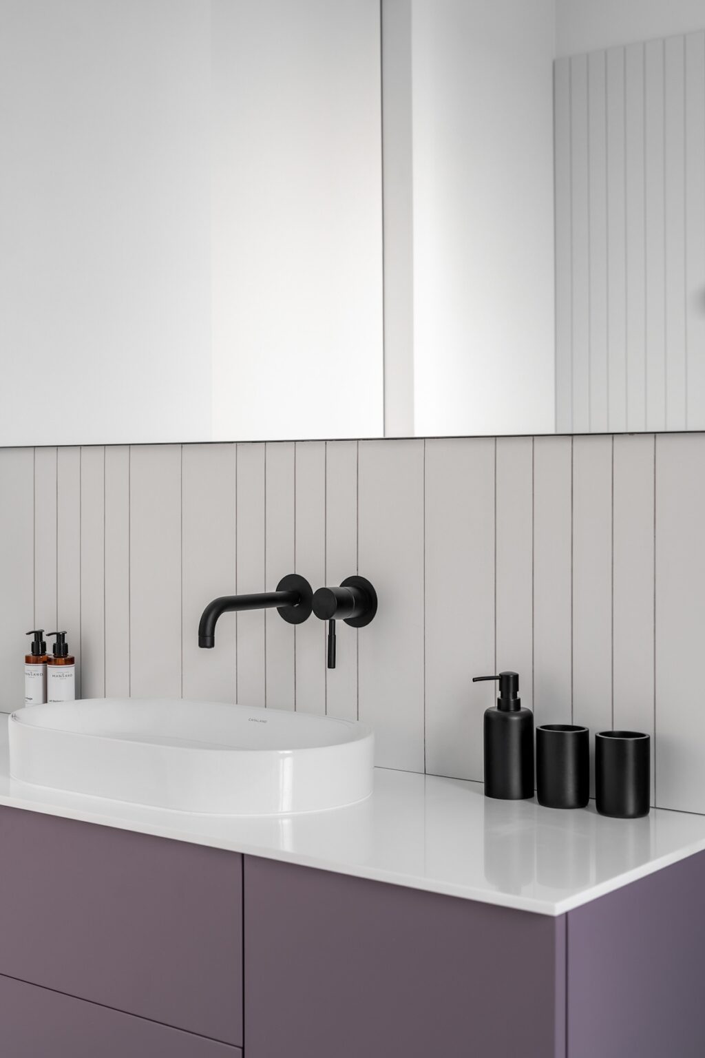

The bathroom connected to this bedroom features a modern-traditional vibe with a touch of lilac (used for the vanity). The vessel sink and matte black fixtures add visual interest. We also love the use of wooden elements for the storage compartments.
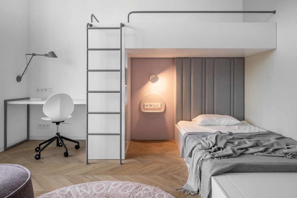

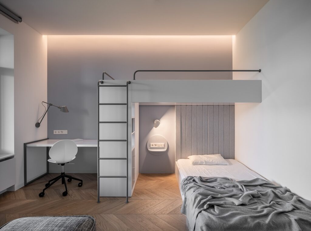

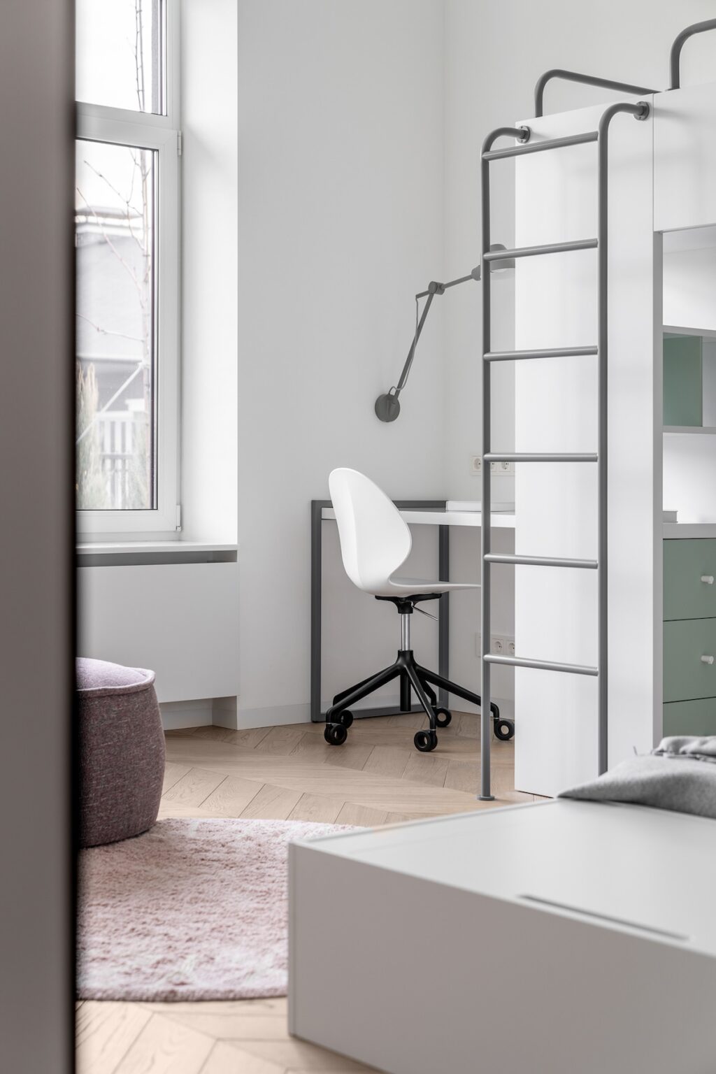

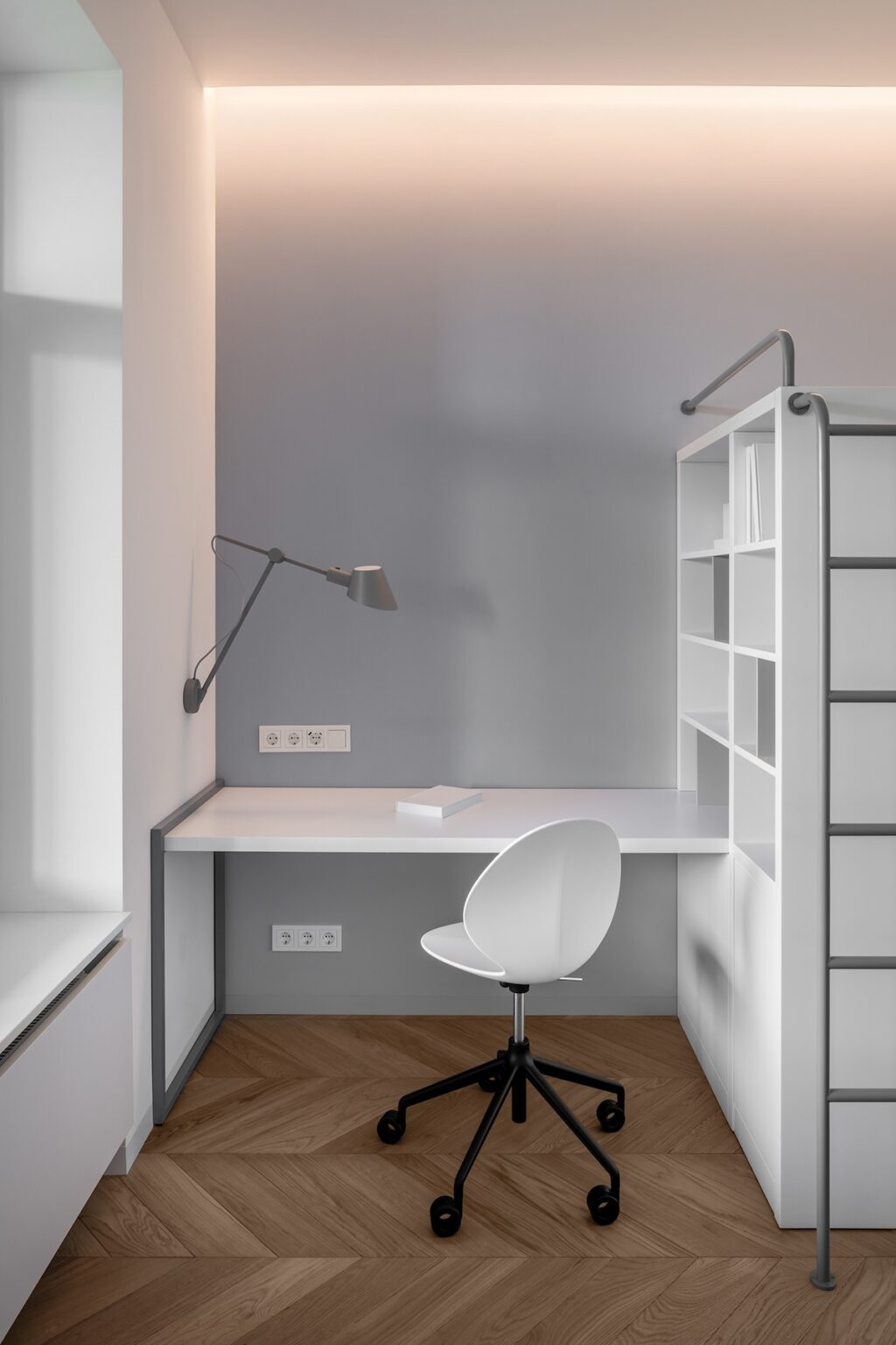

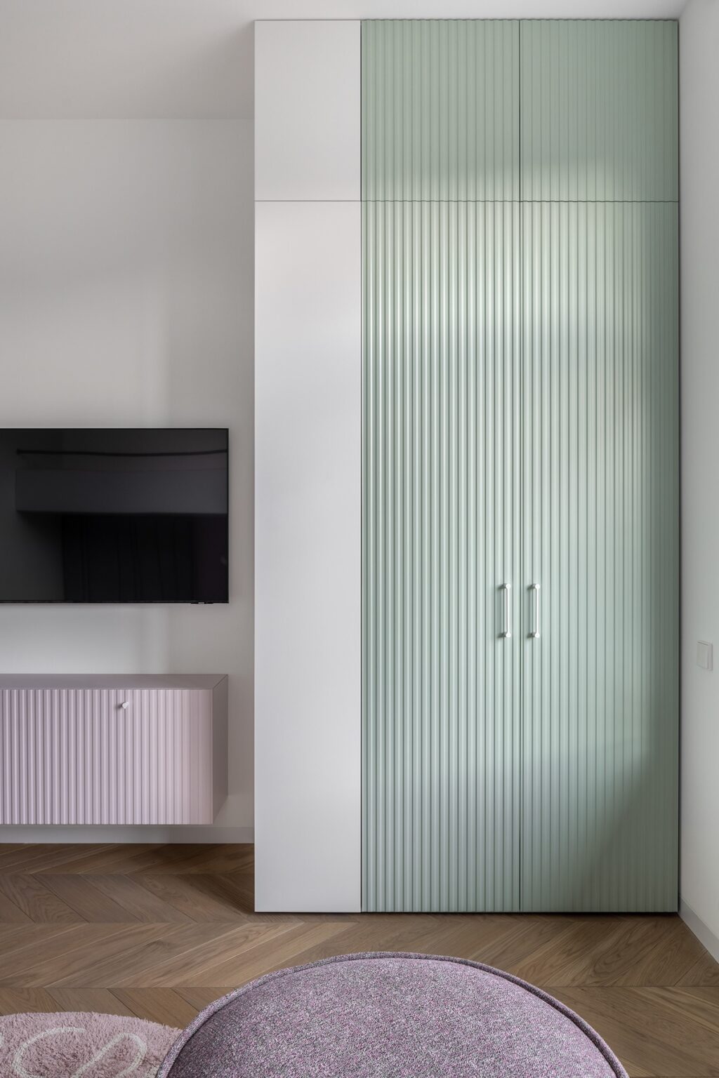

The second bedroom in House Violet sticks true to the Scandinavian style with a white and gray palette, wooden flooring, and cozy textiles. Additional space can be utilized by climbing the ladder mounted against the bookcase—while the nook this creates is perfect for getting some work done. We see mint green for the cabinetry and baby pink for the entertainment complex. This adds a subtle but powerful dash of color!
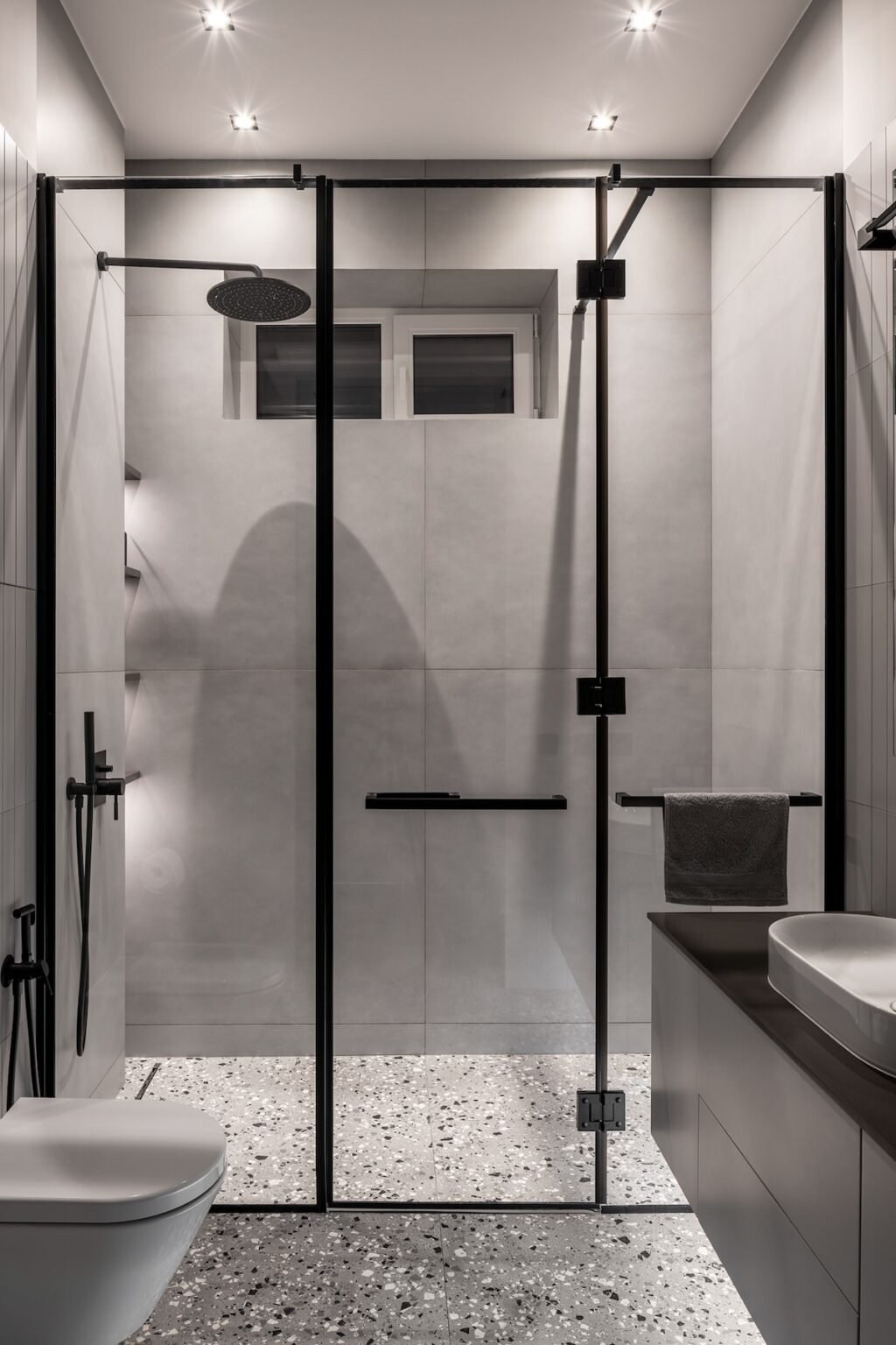

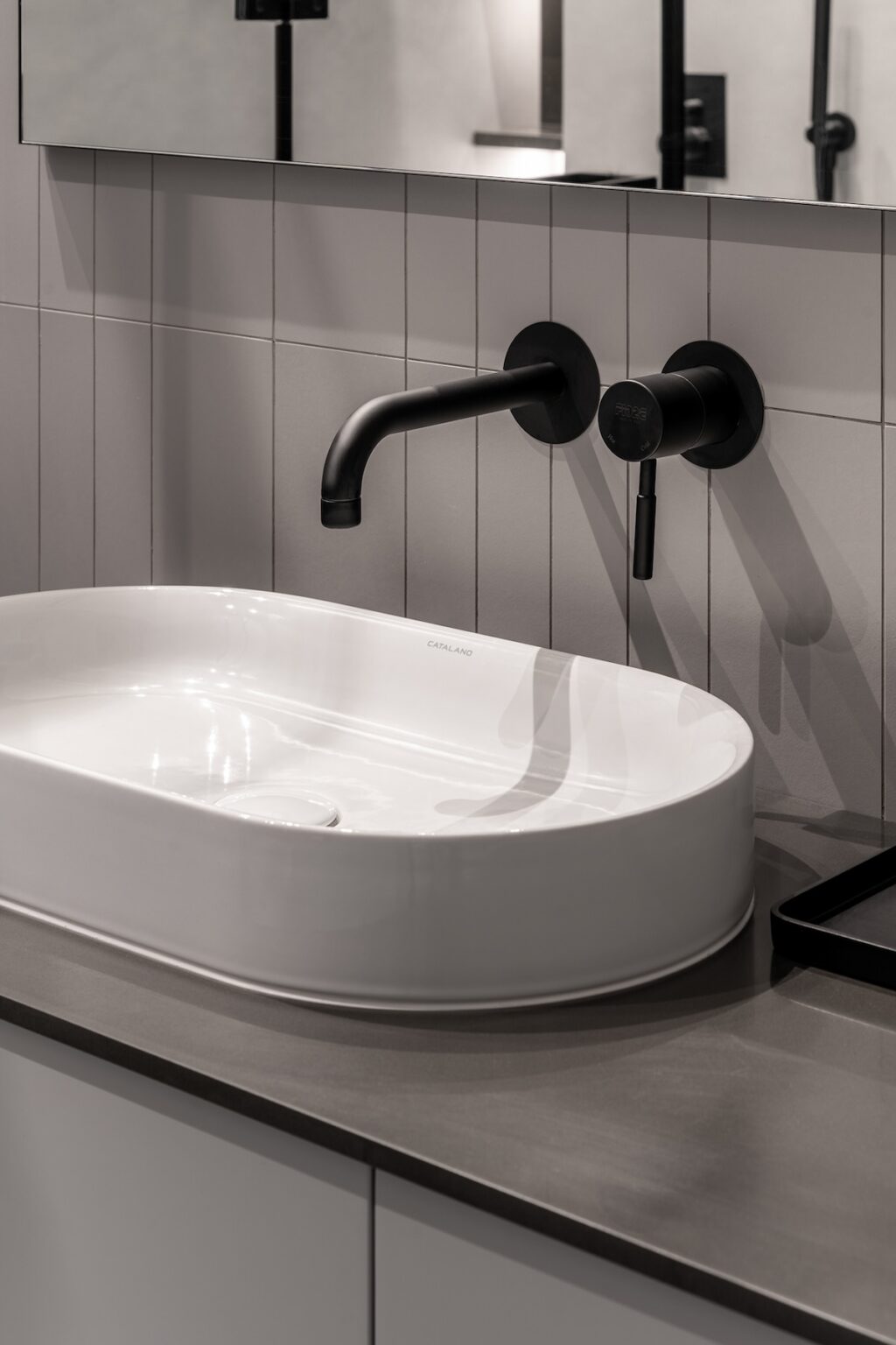

This compact bathroom uses a color scheme of gray and black. The shower cubicle is segregated with a glass partition—the black frames of which add visual interest. Mounting the black vanity onto the wall is a smart move, as it frees up some much-needed floor space in this compact bathroom. Finally, the stone chip flooring keeps the overall look interesting.
