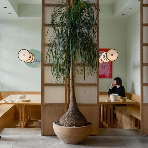
Mexican design studio Locus has utilised 50 per cent recycled materials for the interiors of a Singaporean restaurant in Mexico City.
Combining the varied flavours of Southeast Asia typical of Singapore’s cuisine, Makan serves customers within an industrial-style space in the Centro district of the Mexican capital.
Designers Jachen Schleich and Sana Frini of Locus aimed to prioritise environmental responsibility with the project, and so used recycled materials for half of the total fit-out.
“From the conception stage, the use of sustainable materials was prioritised, particularly the use of national white oak wood in much of the interior design,” said the studio.
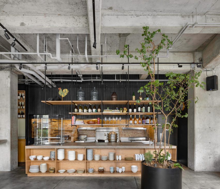
“This choice not only highlights the natural beauty of the surroundings but also ensures proper management of natural resources, promoting environmental conservation and supporting the local industry sustainably,” the team added.
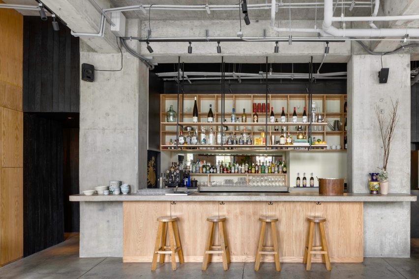
The white oak forms counters, shelving and built-in seating throughout the space, contrasting the exposed concrete floors, columns and ceiling.
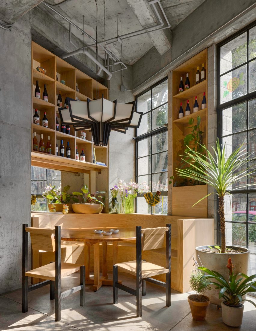
The restaurant has street frontage on two sides, allowing the dining area to be flooded with natural light from tall operable windows.
This minimises the need for artificial light and air conditioning during the day, reducing electricity usage.
Freestanding tables and chairs supplement the booth seating around the perimeter, which includes a curved unit for large parties tucked into a corner.
Shelves above the banquettes are filled with wine bottles, glassware and other accessories, while open storage units are suspended above the two service counters.
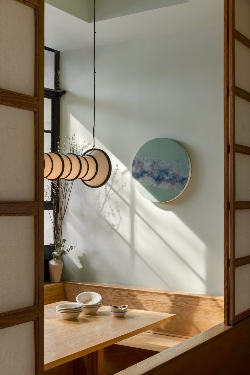
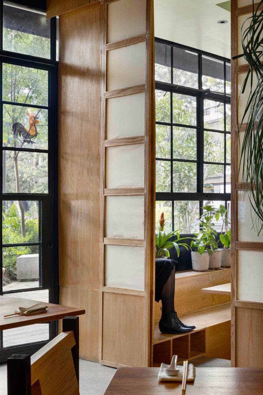
Along one side is a series of private dining spaces behind paper screens, with sunken floors and wooden bench seating.
These rooms, which more closely reflect Asian dining traditions, can be opened up to one another via more screens,
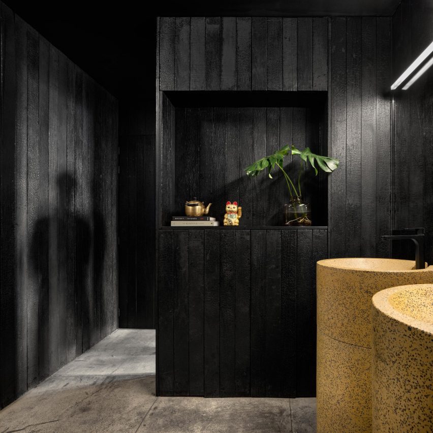
Behind the bar and open kitchen and across the bathroom walls, vertical timber boards are charred to a black finish.
“This technique not only adds a visually appealing element but also ensures durability and resistance, eliminating the need for harmful chemical treatments to the environment and health,” said Locus.
Planters large and small are peppered throughout the restaurant, adding greenery to the interior.
Overall, the tall ceilings, large windows and open kitchen create a light and airy atmosphere, while the material add an industrial edge.
As Mexico City’s food scene continues to grow, several gastro options with interesting interiors have opened over the past few months.
These range from a boba tea shop by Worc Studio to an industrial-style restaurant by MYT+GLVDK and a tiny taqueria by RA!.
The photography is by Rafael Gamo.
Project credits:
Locus team: Jachen Schleich, Sana Frini
Design team: Santiago Sitten, Ruy Berumen, Eduardo Silva
Lighting: Locus x Estudio Nuumbra
Sinks: Locus x Muebles de Concreto
Chairs: Locus x Taller Nacional
Art: It’s A Living, Sindrome de Clerambault
Graphic design: Foreign Policy Design
